Part 1: Mapping Bicycling Ridership and Exposure
Trisalyn Nelson, Founder BikeMaps.org, Professor & Dangermond Chair of Geography, University California Santa Barbara
Meghan Winters, Associate Professor, Faculty of Health Sciences, Simon Fraser University
In 2014, BikeMaps.org launched a tool for crowdsourcing bicycling safety data. What became immediately apparent was that to understand bicycling safety we also needed to understand exposure, that is, the number of bicyclists riding — people who could be involved in a safety incident. Why? Well, the safety risk associated with 10 crashes that occur in a place with 10 bicyclists is very different then 10 crashes that occur in a place with 10,000 bicyclists. The exposure — the denominator — changes the picture entirely.
Data on bicycling exposure, measured as the volume of bicycles, is notoriously hard to obtain. Often cities measure bicycle volume in a few locations, using permanent counters, or at many locations using periodic manual counts. Yet these data lack the spatial and temporal detail needed for representing patterns of cycling across a city, or over time.
Enter Strava. Strava is an app that people use to track their bicycling and it is wildly popular. With over 76 million users worldwide, Strava is continuously generating data on ridership at very high spatial and temporal resolutions. Maps of Strava data can be thought of as a sample of bicycling volumes, where the sample is generated from app users. The BikeMaps.org team has developed analytics to put Strava data to use for multiple applications: for modeling all bicycling ridership and exposure, determining where to put official bike counts, and monitoring change in patterns of bicycling (see Nelson et al 2021a for a review). We have worked on all three of these topics, which we are outlining in a three part blog, with this, the first, being about ridership and exposure.
Strava data provides a map of Strava bicyclists. The trick to using Strava to map all bicyclists is to build a statistical relationship between Strava and official counts and to calculate how many bicyclists are represented by one Strava rider, across different types of streets. For examples, on quiet residential streets one Strava bicyclist may correspond to 50 bicyclists, whereas on a busy multi-lane street one Strava bicyclist may represent 10 bicyclists. We have developed city-specific models (Jestico et al 2016; Roy et al. 2019) and most recently created a generalized model for estimating overall all bicycling ridership using five variables: number of Strava riders, percentage of Strava trips categorized as commuting, bicycling safety, and income (Nelson et al. 2021b). Developed for five North American cities (Boulder, Ottawa, Phoenix, San Francisco, and Victoria) we predicted street level average annual daily bicycling with an accuracy of ±32 to ±160 bicyclists on 75% of streets. All models are built by training a model with official bicycle counts. It turns out that the representativeness of the training data is the biggest determinant of how well the model works. In the ideal situation, cities’ count data includes locations along a wide variety of street types: high ridership as well as low ridership, core areas as well as more peripheral settings, and areas safe for cycling as well as riskier areas. Additional variables can be added to city-specific models to enhance the accuracy of predictions locally. For example, elevation was important in San Francisco, and seasonality mattered in settings with more extreme climates. When locally important variables are added, model accuracy improves to ±22 to ±110 bicyclists on 75% of streets. Typically, we recommend displaying modelled ridership as categories (e.g., very low to very high) rather than continuous data, to most appropriately represent the accuracy of the results (Figure 1).
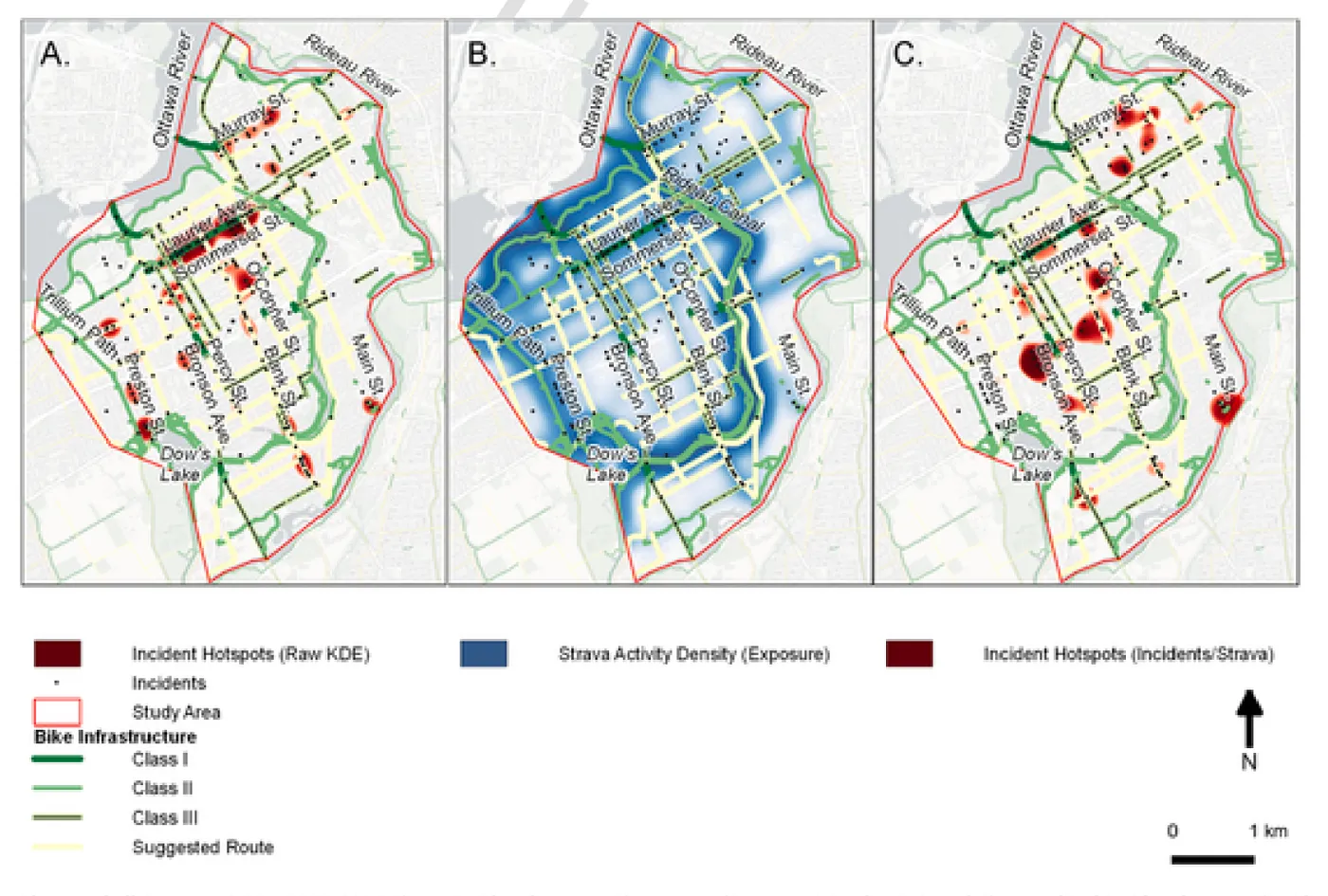
While our initial research focused on improving the spatial resolution of exposure data (we are spatial data scientists after all!) we also realized that we could also use Strava data to tackle data gaps around the temporal resolution of exposure data (Ferster et al. 2021). Temporal variations, such as peak vs. off-peak times or weekday vs. weekends, all impact exposure; ideally denominators in safety analyses should capture that variation. We developed a method to use high spatial-temporal resolution exposure estimates from Strava when mapping bike safety incident hot spots (Figure 2). Analyzing locations of 395 bike safety incidents in Ottawa, Canada, together with Strava data, we explored different ways of characterizing exposure. The bottom line is that it is essential to include exposure when mapping safety: doing so moved incident hot spots away from high ridership areas, like protected bike lanes and multi-use paths, and instead highlighted risks associated with commercial streets that have no bike infrastructure.
Using Strava has enabled us to study bicycle safety. We have used Strava as the exposure data in both an analysis of conditions that lead to injury from bicycling (Fischer et al. 2020a) and a study of safety on multi-use trail crossing with roads (Jestico et al. 2017).
We are also exploring how different aspects of the Strava data (commute/non-commute) may impact who is represented in the sample. Our initial work has found Strava data tagged as commutes occur more often on-street infrastructure, universities, and higher bicycle crash density, compared to data tagged as recreational (Fischer et al. 2020b).
We have given many presentations that include Strava data. Almost always someone asks us if Strava data are representative. The number of total bicyclists represented by one Strava bicyclist varies depending on street safety, infrastructure, traffic volume, proximity to parks, and so on. Luckily, a lot of that variation can be represented by GIS data on the built, natural, and human environments. Especially when combined with robust bicycle count programs, Strava data can be used to accurately map categories (low to high) of all bicycling ridership across cities.
References
Ferster, C.J., Nelson, T. A., Laberee, K., and Winters, M. (2021). Mapping bicycling exposure and safety risk using Strava Metro. Applied Geography. Paper
Nelson T.A., Laberee K., Ferster C., Fuller D., and Winters M. (2021a). Crowdsourced data for bicycling research and practice. Transport Reviews. 41(1), 97–114. Paper
Nelson, T.A., Roy, A., Ferster, C.J., Fischer, J., Brum-Bastos, V., Laberee, K., Yu, H., and Winters, M. (2021b) Generalized Model for Mapping Bicycle Ridership with Crowdsourced Data. Transportation Research Part C. Paper
Fischer J, Nelson T, Laberee K, and Winters M. (2020a). What Does Crowdsourced Data Tell Us About Bicycling Injury? A Case Study in a Mid-Sized Canadian City. Accident Analysis & Prevention, 145. Paper
Fischer J., Nelson T., and Winters M. (2020b) Comparing spatial associations of commuting versus recreational ridership captured by the Strava fitness app. Transport Findings. Paper
Roy, A., Nelson, T.A., Fotheringham, A.S., and Winters, M. (2019). Correcting bias in crowdsourced data to map bicycle ridership of all bicyclists. Urban Science. 3(2): 62. Paper
Jestico, B., Nelson, T.A., Potter, J., and Winters, M. (2017). Multiuse trail intersection safety analysis: A crowdsourced data perspective. Accident Analysis and Prevention. 103: 65–71. Paper
Jestico, B., Nelson, T.A., and Winters, M. (2016). Mapping ridership with crowdsourced cycling data. Journal of Transport Geography. 52: 90–97. Paper