This guest post is by Vanessa Brum-Bastos, Colin Ferster, Trisalyn Nelson at Arizona State University and Meghan Winters at Simon Fraser University.
Many researchers have used Strava data to analyze daily or seasonal patterns in biking to inform long-term infrastructure planning. It is possible using these methods to answer questions such as where the most popular routes are, or where there are gaps in the bike network.
However, it is possible to go further and to leverage the granularity of Strava data to guide more targeted interventions, such as deciding on the placement of bike share stations, the most appropriate location and times for bicycling ridership counts and even the development of bicycling lanes with specific operation hours.
These more detailed characterizations of bicycling behavior are possible using space-time behavior patterns. These patterns can be used to classify bicycling routes and streets into categories, which transportation planners may use to guide the targeted interventions described above.
In this article, we’ll discuss how we utilized Strava Metro bike ridership data from 2017 and continuous signal processing data mining techniques to map regions of bicycling behavior in Ottawa, Canada.
Classifying bike routes and streets
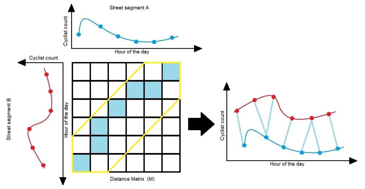
In order to obtain temporal profiles of bicycling ridership, we computed the average hourly activity count for bicycling on weekdays for non-winter months (March through September) for each hour of the day for the 3,880 non-zero-count street segments in a 20 km2 area in downtown Ottawa, ON, Canada.
Next, to quantify the differences between bicycling ridership profiles of all street segments we computed dynamic time warping (DTW) distances. DTW finds the optimal global alignment between two time series by computing a pairwise distance matrix (M) for all points in both time series and finding the least-cost path in M by compressing and expanding the time-series given a limit of time (Figure 1). In order to avoid unrealistic least cost paths (Zhang et al., 2017) we used a Sakoe-Chiba band (Sakoe and Chiba, 1978) (See yellow polygon in Figure 1) to constraint the warping to a one-hour interval before or after the hour being warped.
In order to group street segments with similar bicycling ridership patterns we applied Ward’s hierarchical bottom-up clustering algorithm to the W matrix of time series data. The algorithm starts with each street segment as their own group and successively merges them into clusters, based on the minimum increase in the error sum of squares (Murtagh and Legendre, 2011). We used the Calinski-Harabaz Index (CHI) (Calinski and Harabasz, 1974) for selecting the optimal number of clusters. We varied the number of clusters from one to 50 (more clusters than is practical to interpret) and selected the configuration with the highest CHI. We plotted the profiles within each cluster and analyzed their main characteristics to assign labels that are interpretable by city planners.
From here, we generated six classes of roads:
The temporal and spatial profile of ridership in Ottawa
The analysis enabled us to first map the temporal profile of ridership for all street segments in our study area (see Figure 2 below). Similar profiles have been made from single bicycling counters (Miranda-Moreno et al., 2013), but using Strava data allows richer spatial resolution (more street segments) and also allows greater temporal richness.
Next we computed the mean temporal profile for each ridership class using the clustering algorithm (Figure 3a), and generated a spatial distribution of these classes (Figure 3b). Figure 3b shows clear patterns in the major commute corridors in the city.
As we can see, the majority of bike commuting activity was concentrated on 9% of the total road network, 28.6km, and primarily on roads and paths around the perimeter of the city.
Ottawa recently ended a five-year experiment with bikesharing, but should it decide to reintroduce the service, patterns of this kind could be helpful in identifying areas where demand may most likely be concentrated. Of course, demand considerations should be balanced against other factors, such as providing access to a broad range of communities and ensuring that the service provides access to employment centers.
Implications for bike counter placement
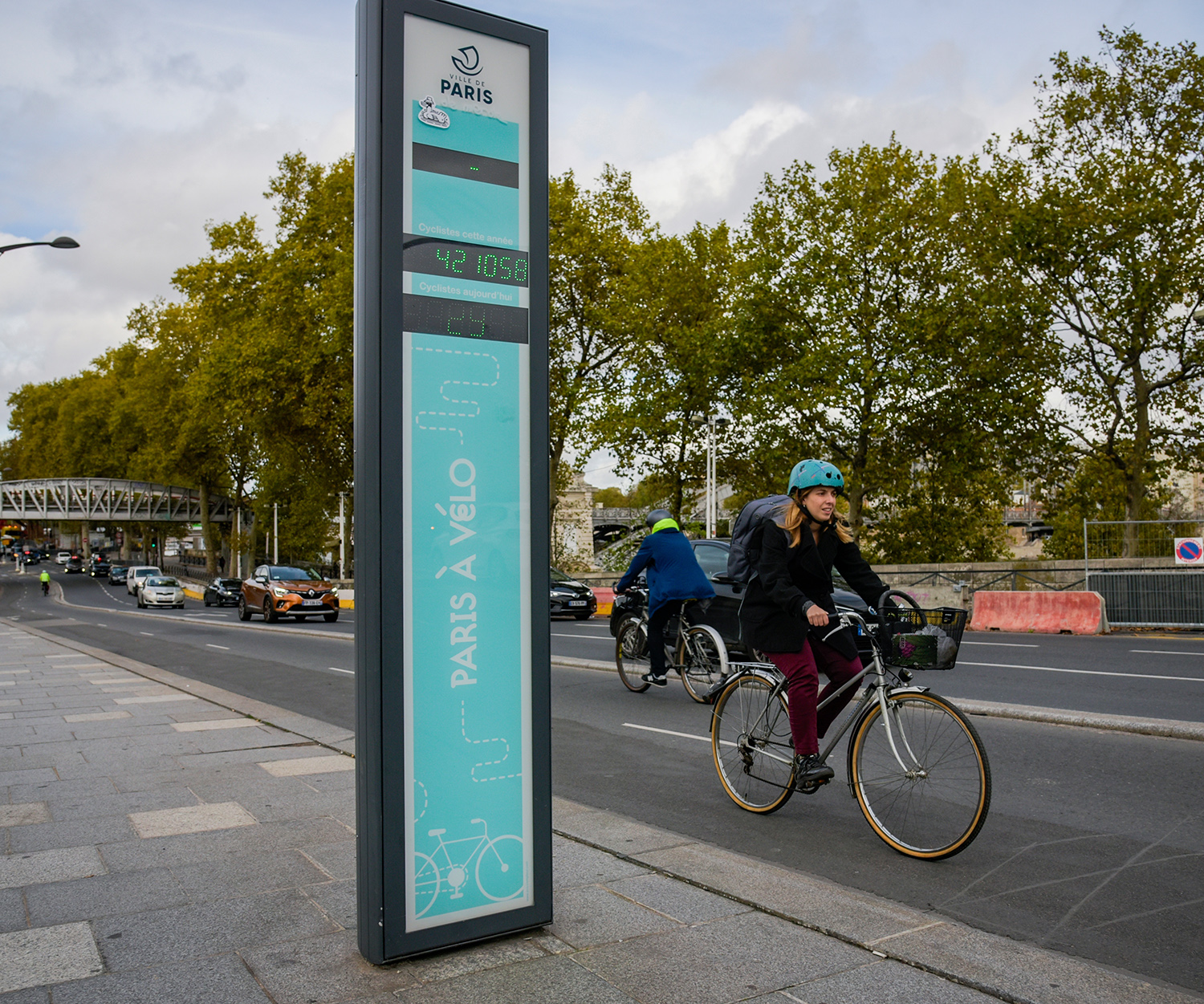
The City of Ottawa has 12 automated bike counters, shown below (Figure 4).
Most of these are located in areas with high commuter bike traffic and new bike infrastructure (physically separated cycle tracks and multi-use trails). Our work using Strava data shows that there are other locations with high rates of bicycling that could be candidate locations for future automated counter installations. Some of the counters are located along routes with consistent temporal patterns, and greater sampling efficiency might be achieved by establishing counters elsewhere.
In addition, the automated counters could be supplemented with lower-cost temporary counts (e.g. camera counters, pneumatic tube counters, or in-person counts) on lower use routes to understand bicycling throughout the city.
Obviously, as any city makes improvements to the network to support bike commuting in new areas, it will become necessary to locate counters in those places to monitor new flows as opposed to simply measuring existing ones. Strava data can be helpful in making these decisions, as well as analyzing whether existing count programs are capturing the full picture of bike ridership in an area.
Read the full paper — Where to put bike counters? Stratifying bicycling patterns in the city using crowdsourced data — in the journal Transport Findings.